Main Usage
The main purpose if this app is a container of a Shiny app package to explore COVID-19 related variables in several countries in Europe. To use this feature, you can use the launch_app function.
#> launch the app
#> make sure to have all of the packages in suggest installed
launch_app()
The launched app would appear as follow:

This app comprises of seven tabs as follow:
-
Home. This tab is a landing page of the app. It gives a very brief overview of the app and the urge to explore the app by clicking each tab in the navbar.
-
Cases and Deaths. You can visualize the cases and deaths of COVID-19 in 51 countries in Europe in daily and cumulative-wise. You can also compare several countries with a certain range of date.
-
Testing. You can explore the COVID-19 weekly testing and positivity rates in 30 countries in Europe (EU/EEA member countries and UK). You can also compare certain countries within certain week range. If you wish to use the data only without launch the app, this package contains that data for your own purpose.
library(tibble)
tibble(c19euxplorer::testing_weekly_eu)
#> # A tibble: 954 x 9
#>    country country_code year_week new_cases tests_done population testing_rate
#>    <chr>   <chr>        <chr>         <dbl>      <dbl>      <dbl>        <dbl>
#>  1 Austria AT           2020-W15       2041      12339    8858775         139.
#>  2 Austria AT           2020-W16        855      58488    8858775         660.
#>  3 Austria AT           2020-W17        472      33443    8858775         378.
#>  4 Austria AT           2020-W18        336      26598    8858775         300.
#>  5 Austria AT           2020-W19        307      42153    8858775         476.
#>  6 Austria AT           2020-W20        363      46001    8858775         519.
#>  7 Austria AT           2020-W21        267      39348    8858775         444.
#>  8 Austria AT           2020-W22        231      46677    8858775         527.
#>  9 Austria AT           2020-W23        184      41063    8858775         464.
#> 10 Austria AT           2020-W24        192      35243    8858775         398.
#> # … with 944 more rows, and 2 more variables: positivity_rate <dbl>,
#> #   testing_data_source <chr>
-
Tracing. The content of this tab is the visualization of weekly dominant source of COVID-19 transmission that aggregated from subnational level of 32 countries in Europe. In this tab, you can only visualize one certain country interactively. I also provided a bubble map to choose a country based on its rate of cases per 10,000 people. If you wish to explore the raw data, apart from the app, you can use this code below, since this package contains that data.
tibble(c19euxplorer::transmission_subnational_level)
#> # A tibble: 11,583 x 4
#>    Country Region     `Level of transmission` Week
#>    <chr>   <chr>      <chr>                   <chr>
#>  1 Austria Burgenland Not reported            2020-W01
#>  2 Austria Burgenland Not reported            2020-W02
#>  3 Austria Burgenland Not reported            2020-W03
#>  4 Austria Burgenland Not reported            2020-W04
#>  5 Austria Burgenland Not reported            2020-W05
#>  6 Austria Burgenland Not reported            2020-W06
#>  7 Austria Burgenland Not reported            2020-W07
#>  8 Austria Burgenland Not reported            2020-W08
#>  9 Austria Burgenland No cases                2020-W09
#> 10 Austria Burgenland Sporadic                2020-W10
#> # … with 11,573 more rows
-
Community Mobility. The objective of this tab is to explore the mobility of people during the pandemic in six types of locations daily. You are able to choose a country to be displayed. You can also choose the time range. I also added an interactive table of country response measure, which shows the start date and the end date of a measure. Since community mobility is developed to observe the effect of measure to the community activity, this table is useful as a benchmark of choosing the date to track that effect.
-
Data. This tab displays the raw data that are used to visualize the variables in the previous tabs. The users are allowed to choose one or more countries, even select all of the countries available. They are also allowed to choose the time range.
-
More. This tab contains two sub-tabs: About and References. The About sub-tab specifies the purpose of the app and other relevant information, such as the data source used in the app and the R packages to make the app. There is also a brief information of my self. The References sub-tab conveys the reference of data sources, readings, packages, and images used in the app.
Additional Usage
Country Centroids Data
Besides those two data sets, I also embedded a country centroids data set. Apart from COVID-19 matter, this data set is useful if you wish to make a bubble map with a point represents a whole country, such as the following map:
tibble(c19euxplorer::country_centroids)
#> # A tibble: 241 x 3
#>    name_long            Longitude Latitude
#>    <chr>                    <dbl>    <dbl>
#>  1 Aruba                   -70.0      12.5
#>  2 Afghanistan              66.0      33.8
#>  3 Angola                   17.5     -12.3
#>  4 Anguilla                -63.1      18.2
#>  5 Albania                  20.0      41.1
#>  6 Aland Islands            20.0      60.2
#>  7 Andorra                   1.56     42.5
#>  8 United Arab Emirates     54.3      23.9
#>  9 Argentina               -65.2     -35.4
#> 10 Armenia                  44.9      40.3
#> # … with 231 more rows
#>the map
ggplot() +
      geom_polygon(data = world_map,
                   aes(x = long,
                       y = lat,
                       group = group),
                   fill = "#73C6B6",
                   colour = "white",
                   alpha = 0.7
      ) +
      geom_point(data = pop_map,
                 aes(x = Longitude,
                     y = Latitude,
                     colour = population,
                     size = population,
                     alpha = population)) +
      scale_size_continuous(range = c(1, 6)) +
      scale_color_viridis(option = "inferno", trans = "log") +
      scale_alpha_continuous(trans = "log") +
      guides(colour = guide_legend()) +
      xlab("") +
      ylab("") +
      theme(panel.grid = element_blank(),
            axis.title = element_blank(),
            axis.text = element_blank(),
            axis.ticks = element_blank(),
            plot.background = element_rect(fill = "white"),
            panel.background = element_rect(fill = "white")) +
  labs(title = "Population Bubble Map")
#> Warning: Removed 1 rows containing missing values (geom_point).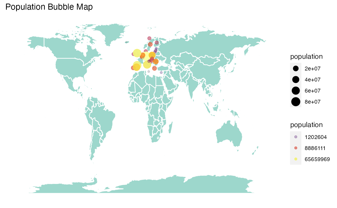
daily_indicator()
This function aims to simplify the code in c19euxplorer shiny app by selecting country, date, and indicators in daily data to be visualized in Cases and Deaths tab. This function would be used in the app, although you can also use this function outside the app. However, make sure to have these variables (with the exact same name) in your data frame in order to make the function works.
- daily_cases
- daily_deaths
- daily_cases_rate
- daily_deaths_rate
- country
- date
plot_daily <- plot %>%
  rename(daily_cases = new_cases,
         date = year_week)

plot_daily_new <- daily_indicator(plot_daily, "Cases")
tibble(plot_daily_new)
#> # A tibble: 954 x 3
#>    country date     count
#>    <chr>   <chr>    <dbl>
#>  1 Austria 2020-W15  2041
#>  2 Austria 2020-W16   855
#>  3 Austria 2020-W17   472
#>  4 Austria 2020-W18   336
#>  5 Austria 2020-W19   307
#>  6 Austria 2020-W20   363
#>  7 Austria 2020-W21   267
#>  8 Austria 2020-W22   231
#>  9 Austria 2020-W23   184
#> 10 Austria 2020-W24   192
#> # … with 944 more rows
getplot()
Here, I would give you an example of the usage of getplot() function. We could use plot_cumulative to make a plot. However, since there are a lot of countries, we would like to choose only several countries.
library(lubridate)
#>
#> Attaching package: 'lubridate'
#> The following objects are masked from 'package:base':
#>
#>     date, intersect, setdiff, union
for_plot <- plot_daily_new %>%
  mutate(week_only = as.numeric(sub(".*W", "", date))) %>%
  filter(country %in% c("Austria", "Spain", "United Kingdom")) %>%
  mutate(date = as.Date(paste(2020, week_only, 1, sep="-"), "%Y-%U-%u"))

getplot(for_plot)
getref()
Currently, I have not found a package that facilitate the creation of reference in Shiny. So, I made this function to make the reference writing come in handy.
Using the HTML tag provided by Shiny, you have to type this code to create a reference like this:
tags$li(class = "li-custom", "Winston Chang. (2018).",
        tags$a(href = "https://CRAN.R-project.org/package=shinythemes",
              "shinythemes: Themes for Shiny",
              class = "externallink"))
Winston Chang. (2018). shinythemes: Themes for Shiny
With getref(), you just have to type this:
getref("Winston Chang",
       "2018",
       "https://CRAN.R-project.org/package=shinythemes",
       "shinythemes: Themes for Shiny")
getlink()
Just like getref(), getlink() also aims to simplify the typing of link in Shiny app’s UI using the HTML tag. Initially, Shiny has a markdown function to also make this task easier. However, markdown adds the new hyperlink text into a new line. Sometimes, we want to use some hyperlink texts in one sentences.
Using HTML tag, you have to type this code to create this hyperlink text:
Master of Business Analytics
tags$a(href = "https://www.monash.edu/study/courses/find-a-course/2021/business-analytics-b6022?gclid=EAIaIQobChMI5bKC_Y-g7AIVzn8rCh3aQABbEAAYASAAEgK09PD_BwE&international=true#overview-1",
       "Master of Business Analytics",
       class = "externallink")
With getlink(), you can just type this:
getlink("https://www.monash.edu/study/courses/find-a-course/2021/business-analytics-b6022?gclid=EAIaIQobChMI5bKC_Y-g7AIVzn8rCh3aQABbEAAYASAAEgK09PD_BwE&international=true#overview-1",
        "Master of Business Analytics")