COVID-19 Pandemic
covid.RmdWhat does the COVID-19 dashboard do?
The COVID19dashboard package used to provide interactive visualisation of the COVID-19 pandemic dataset by using the shiny dashboard. The COVID-19 data contains the data over 210 countries since 31 Dec 2019. The COVID-19 data sourced from Our World in Data.
The package and part of the data can be accessed via:
library(COVID19dashboard)
#> Loading required package: shiny
#> Loading required package: tibble
#> Loading required package: shinydashboard
#>
#> Attaching package: 'shinydashboard'
#> The following object is masked from 'package:graphics':
#>
#>     box
library(tibble)
covid_raw
#> # A tibble: 46,484 x 41
#>    iso_code continent location date       total_cases new_cases new_cases_smoot…
#>    <chr>    <chr>     <chr>    <date>           <dbl>     <dbl>            <dbl>
#>  1 AFG      Asia      Afghani… 2019-12-31           0         0               NA
#>  2 AFG      Asia      Afghani… 2020-01-01           0         0               NA
#>  3 AFG      Asia      Afghani… 2020-01-02           0         0               NA
#>  4 AFG      Asia      Afghani… 2020-01-03           0         0               NA
#>  5 AFG      Asia      Afghani… 2020-01-04           0         0               NA
#>  6 AFG      Asia      Afghani… 2020-01-05           0         0               NA
#>  7 AFG      Asia      Afghani… 2020-01-06           0         0                0
#>  8 AFG      Asia      Afghani… 2020-01-07           0         0                0
#>  9 AFG      Asia      Afghani… 2020-01-08           0         0                0
#> 10 AFG      Asia      Afghani… 2020-01-09           0         0                0
#> # … with 46,474 more rows, and 34 more variables: total_deaths <dbl>,
#> #   new_deaths <dbl>, new_deaths_smoothed <dbl>, total_cases_per_million <dbl>,
#> #   new_cases_per_million <dbl>, new_cases_smoothed_per_million <dbl>,
#> #   total_deaths_per_million <dbl>, new_deaths_per_million <dbl>,
#> #   new_deaths_smoothed_per_million <dbl>, new_tests <lgl>, total_tests <lgl>,
#> #   total_tests_per_thousand <lgl>, new_tests_per_thousand <lgl>,
#> #   new_tests_smoothed <lgl>, new_tests_smoothed_per_thousand <lgl>,
#> #   tests_per_case <lgl>, positive_rate <lgl>, tests_units <lgl>,
#> #   stringency_index <dbl>, population <dbl>, population_density <dbl>,
#> #   median_age <dbl>, aged_65_older <dbl>, aged_70_older <dbl>,
#> #   gdp_per_capita <dbl>, extreme_poverty <dbl>, cardiovasc_death_rate <dbl>,
#> #   diabetes_prevalence <dbl>, female_smokers <dbl>, male_smokers <dbl>,
#> #   handwashing_facilities <dbl>, hospital_beds_per_thousand <dbl>,
#> #   life_expectancy <dbl>, human_development_index <dbl>
How to launch the COVID-19 dashboard?
By using the launch_app() function to run the shiny dashboard. This app aims to complement the raw data by providing interactive visualisation and used to compare the difference between the countries.
How to use the COVID-19 dashboard
The shiny dashboard contains four tabs: Data, About, Change in Visitors by Category and COVID-19 Cases/Deaths. Following are the discussion of the contents of these four tabs.
-
Data: To display the raw data used in this app, users can select the variables and observations they want to view.
-
About: Relevant information about this app, such background of the COVID-19, code used to create this app, creator and references.
-
Change in Visitors by Category: Show the change in the frequency of people going to the places compared to before the pandemic.
- COVID-19 Cases/Deaths: Use plots and tables to show the difference in the number of cases and deaths between countries, as well as the trend of those number changes over the past few months.
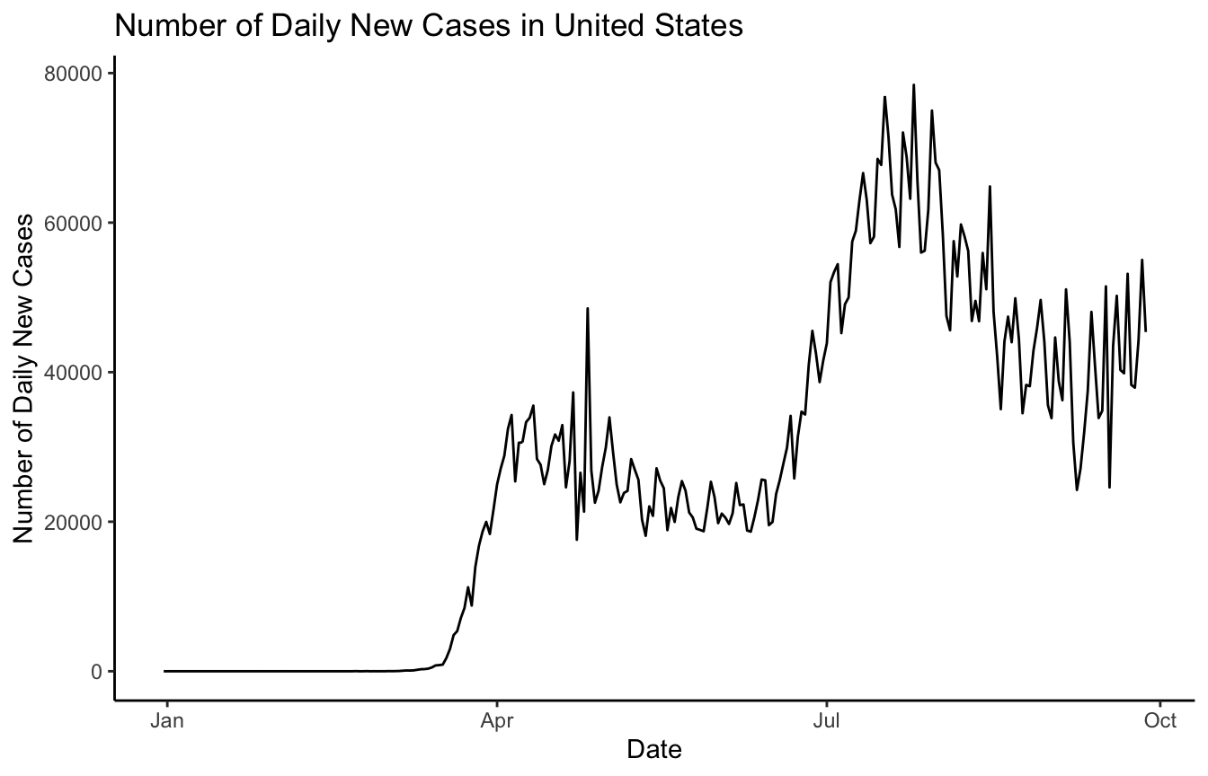
Exploration of the data
Change in the number of daily new cases in the United States:
library(tidyverse)
#> ── Attaching packages ─────────────────────────────────────── tidyverse 1.3.0 ──
#> ✓ ggplot2 3.3.2     ✓ dplyr   1.0.2
#> ✓ tidyr   1.1.2     ✓ stringr 1.4.0
#> ✓ readr   1.4.0     ✓ forcats 0.5.0
#> ✓ purrr   0.3.4
#> ── Conflicts ────────────────────────────────────────── tidyverse_conflicts() ──
#> x dplyr::filter() masks stats::filter()
#> x dplyr::lag()    masks stats::lag()
covid_raw %>%
  dplyr::filter(location == "United States") %>%
  ggplot() +
  geom_line(aes(x = date, y = new_cases)) +
  theme_classic() +
  ylab("Number of Daily New Cases") +
  xlab("Date") +
  ggtitle("Number of Daily New Cases in United States")